Website Must-Haves: Design Essentials for Client Acquisition
🇩🇪 Lieber auf Deutsch? Klick hier
This is part 3 of a 6-part series on building the best website for your service-based business. Make sure to check out the previous chapters!
PART 3: YOUR SERVICE-BASED WEBSITE MUST-HAVES
If you do not have a website, or you have one but it has been a few years since anyone has worked on it, then this next section is for you. When I have a conversation with a new client, it usually starts with "How do I get more traffic?" or "What tricks can I use to get more visitors to my website? I tell them that you don't need tricks. You need to think about what you want your website to accomplish and what your website visitors want to accomplish.
Then the question becomes, "What needs to be on my website? Or how many pages does my site need? I tell them it depends. You can get away with a one-page site. Yes, you can. Maybe a photographer has to be more creative here, but it can be done. If you use smart navigation to direct visitors to the areas they are looking for, you can get away with a single page. For most businesses, I tell them they will need 3-8 pages.
Now, before we can start building web pages, there are a few things that need to be answered. Your story must be clear and lead your potential customers to the information and action you want them to take. You know how a supermarket works – they guide you through the store, highlight special offers, and make it easy to find what you need. Your website should function similarly.
How does someone go from curious to interested to ready to take action with you?
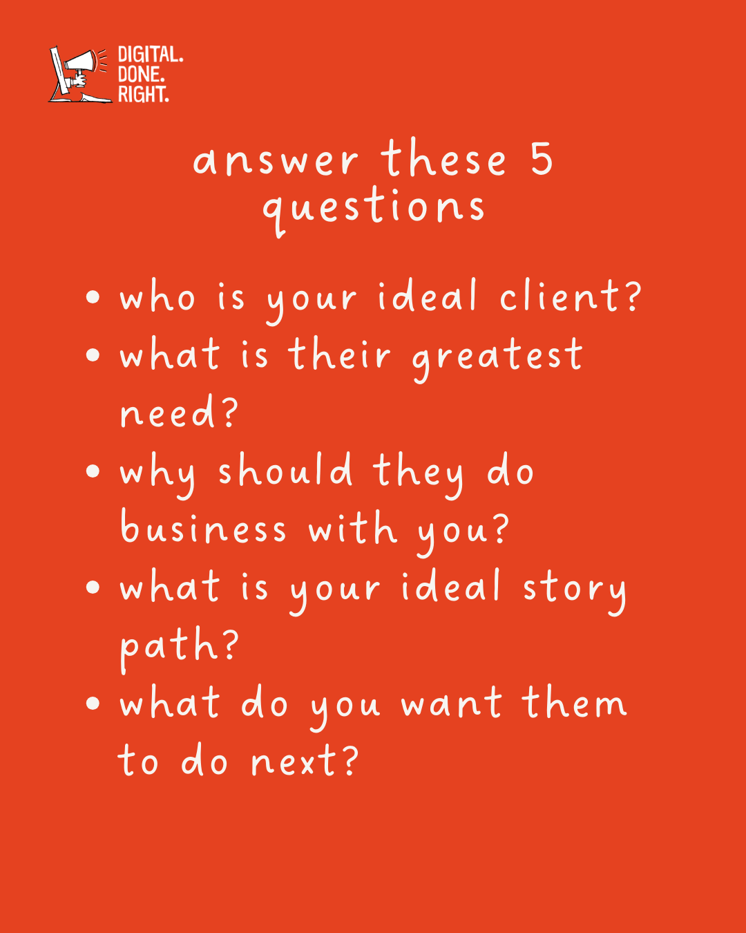
5 Questions you must answer before starting
To achieve this, your service-based website must-haves include:
Clear Value Proposition: Explain what makes you different and how your services solve specific customer problems.
Compelling Content: Informative and engaging content that educates potential clients about your services and industry.
Targeted Calls to Action (CTAs): Clear prompts that guide visitors towards taking a desired action (e.g., contact you, download a guide).
Structure and User Experience:
Easy Navigation: A user-friendly website structure allows visitors to quickly find the information they need.
Mobile-Responsive Design: A website that adapts seamlessly to different screen sizes for optimal viewing on any device.
Clear Conversion Path: A well-defined journey that guides visitors toward becoming leads or customers.
Additional elements:
Storytelling Approach: Use storytelling to connect with visitors on an emotional level and showcase your value proposition.
Specific Content for Your Ideal Client: Tailor your website content to the specific needs and interests of your ideal customer.
Lead Capture Mechanism: A way to collect contact information from potential clients, such as a contact form or email signup.
By incorporating these essential elements, you can create a client-generating website that attracts visitors, converts them into leads, and ultimately helps you grow your business.
Read on!
"I WANT MORE SERVICE-BASED COMPANIES TO BE SUCCESSFUL WITH THEIR ONLINE ACTIVITIES!"
WHAT DO YOU OFFER TO SOLVE THE VISITOR'S NEED?
Think about it. You provide a service or many services. What do you do?
I am a financial advisor
I help people plan for their future.
Why do they need your service?
They are concerned about their financial future
I build websites
I help businesses get more traffic to their websites
So why do they need your services?
They want to grow their business using the Internet
These are real examples and show the steps you need to go through to be ready for your website. Take your business and ask yourself these questions
What does my business do?
Why do people need my services?
Once you have done that, you can move on to the next step - differentiating your business from the competition.
Why should they choose you?
I work with a lot of local service companies. When I work with a new local business, I study all of their competition in the area. I use that information to guide my client to something better than the rest. Then I ask the question;
What makes you different from the 28 others here?
You should communicate the unique benefits and value you provide to your target audience. This will set you apart from your competitors and answer the question of why potential customers should choose your services.
Why should someone choose you?.
Your value proposition helps you effectively communicate what makes you different, address customer pain points, and show how your services can solve specific problems. This clarity and focus on value will help you attract the right customers, build trust, and ultimately grow your business.
Here are three examples of different value propositions for a website designer:
Specialized Websites for Wine Sellers
We specialize in designing and developing custom websites that perfectly reflect your wine brand.
Our team of experienced designers understands the unique needs of wine sellers and will work closely with you to create a website that stands out in the competitive wine industry.
With our expertise, your site will not only be visually stunning but also optimized for usability and conversion, helping you attract and engage wine enthusiasts and drive sales.
Responsive and Mobile-First Design
We specialize in creating websites that adapt to different screen sizes and are optimized for mobile devices.
In today's digital world, your website must provide a smooth browsing experience on any device.
Our designs not only look great but also work well and are easy to use on all devices, ensuring that your target audience can easily access your website anytime, anywhere.
User-Centric and Conversion-Driven Design
Our approach to website design revolves around your target audience and their needs.
We conduct in-depth research to understand their preferences, behaviors, and challenges.
With this valuable insight, we create designs that are intuitive and drive users to desired actions, ultimately helping your business grow.
Our sites strike the right balance between aesthetics and usability to maximize engagement and conversions.
These value propositions showcase different aspects of a website designer's services to meet client needs and preferences.
What do you think of these? Are any of them helpful to you? Leave me a comment below!
What path should they take?
The purpose of your website is to attract visitors to discover your service, inform them about your services and special qualifications, and then get them to take action. This 'path' is called the 'conversion process'. We convert them from a visitor to a potential customer.
The process goes something like this:
A person has a problem.
They search online for solutions.
Your site appears in the search results.
They click on the link to the blog you wrote on the topic to read it.
As they continue to read, they click on the button option visible at the bottom of your blog post that pulls them in for a customized offer. The visitor becomes a consumer.
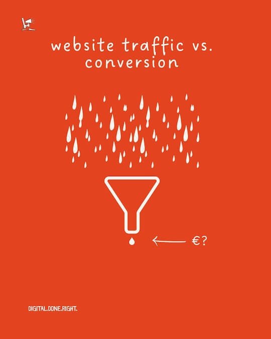
They are now a "lead" (remember the funnel?) and now you can engage with them further.
Tying it all together is understanding what buyers of your service are looking for and having information on your site that matches that. Then position an action for them to take! Oh, that "action" part is what we will cover next.
What should they do next?
This may be obvious to some of you, but I see a lot of service business websites every week, and I can barely tell what they want me to do. There is a 'download this here'. Then there is a 'read more about this.' Finally, there might be a 'call us'.
These are called calls to action. They ask the website visitor to do something. There may be more than one CTA on a website. If so, one should be the primary and the other the secondary. This needs to be visible by design.
Remember I mentioned the 'funnel' view of getting more customers? This is what CTAs do. They are like magnets that pull the customer into the funnel. If successful, you get a new prospect or lead. The confusing use of CTAs on a website makes it hard for the visitor to decide and may just let the magnet slip away.
On your home page, which we will come to next, there should be a clear CTA for the visitor to follow. This could be "visit our showroom," "download this how-to guide," "call now," or "schedule a consultation. These are all examples of CTAs.
Service companies will often use the following CTAs:
Call us now
Send us your questions
Schedule a call
Download this helpful guide
Two of these are high-commitment CTAs. Can you guess which ones? Yes, the two with the call action, because that makes the visitor think, are they ready for a sales call? Remember, you are only looking for the lead at this point. Getting their email address would be a great first step. Setting up a call would be even better, but think about your site visitor's situation.
Are they ready to commit?
Then good luck!
How to get clients to act
You have come a long way. You know the needs of your website visitors. You have defined what you offer. You have defined why the visitor should buy from you. You understand the path you want them to take. You have also determined what action they should take next.
Now we can start cooking. There is one question we have not covered so far and that is "Who is the buyer? There are many variables here, starting with the type of services your business provides. A hairdresser's customers are very different from a small business owner looking for a new website.
I am going to stay in my wheelhouse. That means I will use examples from my business. We answered the questions in the previous section, and now it is time to put it all together. I sell to other businesses, small to medium-sized businesses. I usually sell to the owner of the business or his direct partner. This makes getting decisions easy, but it also makes getting their time difficult.
Knowing this, I have to design my website to 'cut to the chase'. That means I need to get to the point. I imagine the scenario they are in as I build my visitor journey.
Who are they?
Where are they?
What is their biggest need?
Think about it. Put yourself in their shoes. You probably have the answers to most of these questions.
You own a small business.
You are at home.
It's 9 p.m. and you just finished another 14-hour day.
You know there is more growth potential out there on the Internet.
This person finds you and your website somehow.
What do you tell them?
Get more leads with a customer-generating website!
How do they feel?
Well, OK. What should I do?
Get a free online health check. Just send me your website and email address and you will receive a personalized report in your mailbox with no strings attached.
What do they do?
They enter their website and email address and go to bed. Tomorrow is another 14-hour day.
All that was the story behind my website. I may not know how they found my site, but once they landed, I got their attention. I made the process easy to understand and easy to navigate. My goal was clear - to get their contact information. My offer was clear - a free personalized report.
Now, your client's situation may be different. The same process can be followed. Understand your buyers and meet them where they are. Remember, no museums! Let's go to your website.
WRAPPING UP
Now that we have covered the reason for your website, who the website is for, what you are looking to accomplish, and the structural conventions we can finally move on to how to build your website. I mentioned at the top of this article that you might be able to have a single page as your website. Cleaver navigation and excellent guidance can make that successful.
As a service-based business you have three pages (or sections on a one-page website) you must have:
Homepage
About Us
Our Services
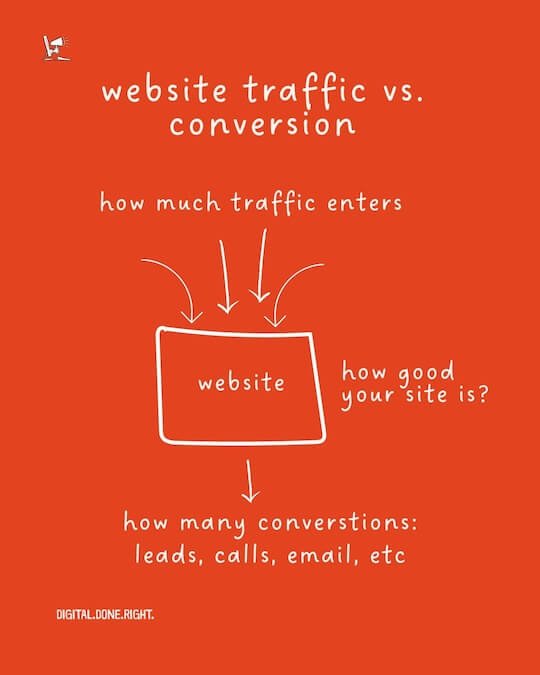
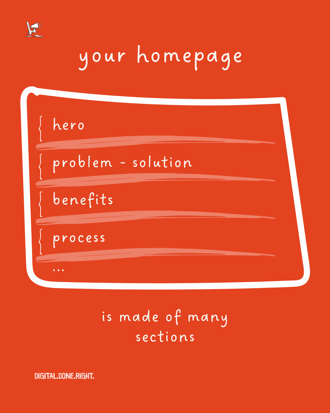
Let’s get started at making that ultimate homepage. We don’t only want to increase the traffic to your homepage, we want to convince and convert them to potential clients.
Let’s go!
TL;DR
This page discusses the essential components needed for a service-based website, including understanding your target audience, defining your value proposition, guiding visitors through a conversion process, and strategically placing call-to-action buttons.
By answering key questions about your business, identifying customer needs, and providing clear and compelling information, you can create a website that attracts and converts potential clients.
👆🏻 Back to Top 👆🏻

