Craft the Perfect Homepage: Attract & Convert Clients
🇩🇪 Lieber auf Deutsch? Klick hier
This is part 4 of a 6-part series on building the best website for your service-based business. Make sure to check out the previous chapters!
PART 4: THE MUST-HAVE PAGE FOR YOUR WEBSITE
So, finally, we get to the meat of this series: building your website. You may have skipped down from the top, and I don't blame you. This guide has become more than I originally intended. You may find that some terms and questions are not clear here. Go back to earlier sections to learn more.
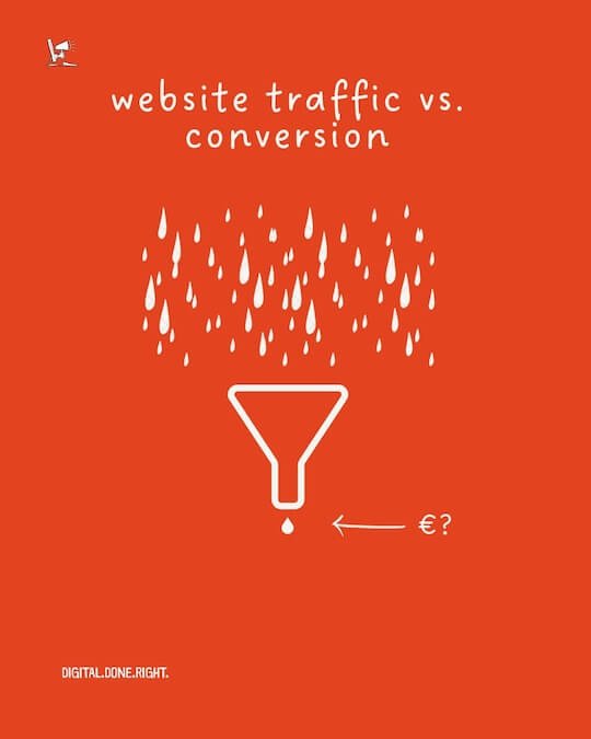
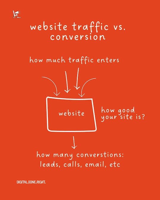
You run a service and you want more customers to find you and choose you over the competition. You need more traffic to your website. The more people find your site, the more likely you are to grow your business. It is that simple, right? Well, yes and no.
Getting more traffic to your website is done through SEO (Search Engine Optimization) or optimizing your website for search. An easy way to get more traffic to your website is through PPC (pay-per-click). This is where you pay a platform like Facebook or Google to promote your website. You can also drive more traffic to your website through your social media activities.
Getting the traffic is part of the equation. Keeping that visitor's attention and giving them enough information to schedule a call or leave their email address is the main task once they arrive. This starts with the most important page on your site - the home page. Let's take a look at how to create the perfect home page for your service-based business.
"I WANT MORE SERVICE-BASED COMPANIES TO BE SUCCESSFUL WITH THEIR ONLINE ACTIVITIES!"
Your perfect homepage
As the name implies, the homepage is the front door to your online presentation. Sure, you might be on Instagram or some other platform, but for a service-based business, it's the homepage every new customer will visit. All those 5-star reviews are super important, but the client will click on your homepage link to see what's behind the curtain.
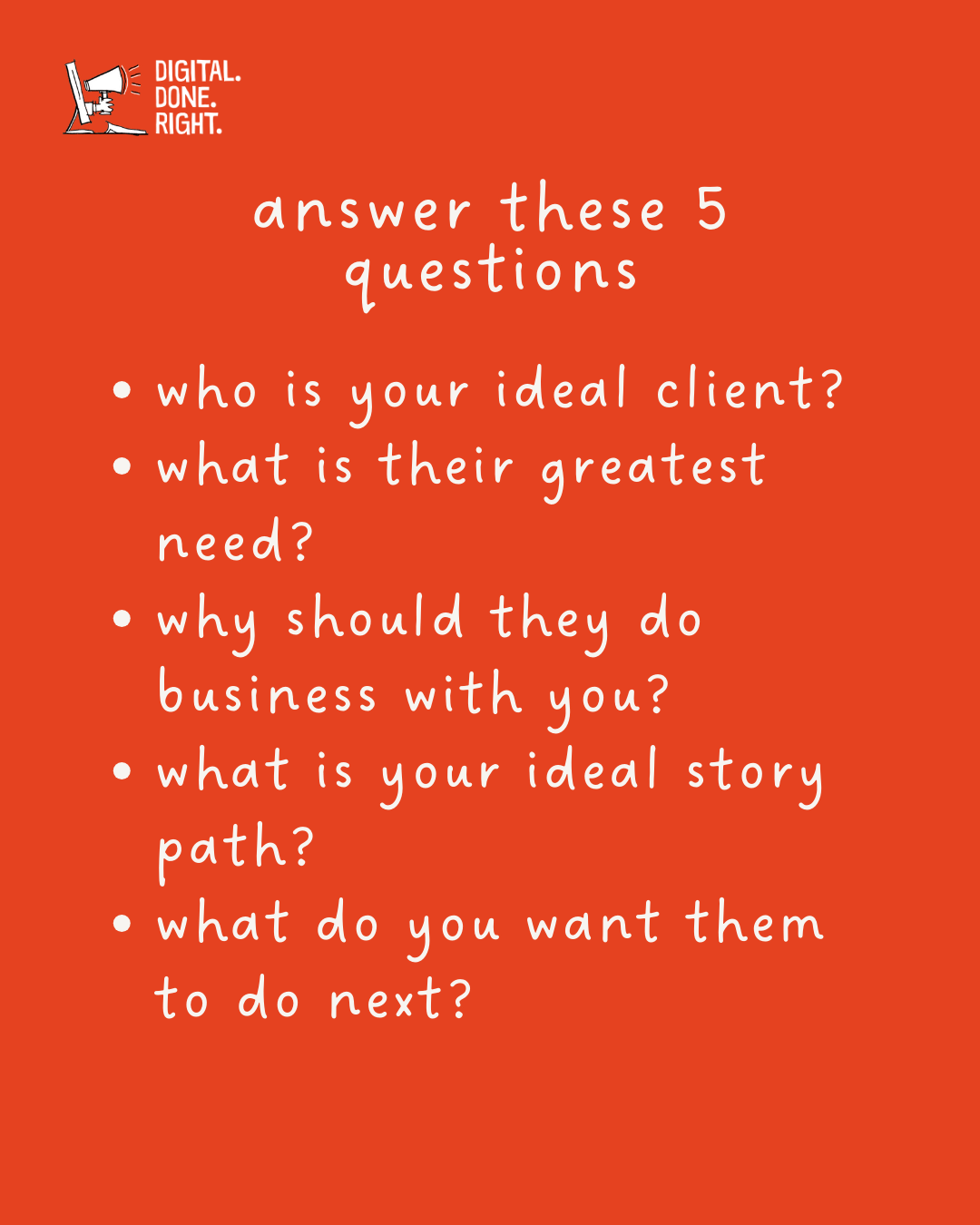
This is where the insights from the previous section come into play.
Who is this person?
What problem are they trying to solve?
How do you uniquely solve their problem?
What other questions do they have?
What one thing do you want them to do (CTA)?
If you can meet them, virtually of course, and provide them with answers, then you are on the right track. The structure of your website should follow a known path. Remember, the visitor is not coming to buy. They are looking around. They are looking for information. They are learning about your business. They are looking behind the curtain. It would be best if you guided them to find what they want.
Your service company's home page is usually the first page visitors see, so it's important to make a strong first impression. It may also be the only page they see.
Elements of your homepage
From here on out, I will be more specific than descriptive about the elements, their purpose, and their placement. I want you to take this blueprint and apply it to your business. I mentioned earlier that you are telling a story with your home page. You provide a service and the visitor to your site is looking to solve a problem.
When I talk about the elements of your website, I will use the term "sections". This will become clear as you read through this next part.
The hero section
You have 7 seconds
Get it done right!
Research says you have 7 seconds to grab a visitor's attention - 7 seconds. Others report even less time on a mobile device. The top of your homepage is called the hero section. This is what they see when they first open the site. No scrolling! Anything that requires scrolling is called 'below the fold.' This comes from the newspaper world. The most important points are made 'above the fold' to grab the reader's attention.
Same here in the online world. Remember, you only have 7 seconds. The hero section is about your client, not you. This section is about what the client gets from you - the result. The hero section consists of 3 to 5 elements. The first 3 I see here as necessary.
Headline - The headline should be based on your customer's biggest need or desire that you can solve. Customers buy results, not features!
Here are a few ideas
Lead with the outcome, the end result
What does your client want? A nice new bathroom?
There are three types of heroic headlines
Transformation or Benefit Statement - Interior designer, talking about the after-state. "Experience the [benefit] our clients rave about."
Problem Solving Statement - Locksmith solves the problem. "Tired of dealing with [problem]? We can help."
What Makes Us Different Statement - Tax Specialist "Our [Unique Selling Point] is what makes us the best choice for your [industry]."
Sub-headline - This should be a concise and compelling summary of the headline. It should reinforce the message of the headline and provide additional context or information that will entice visitors to read more.
Here are some tips for writing a good subheading:
Keep it short and sweet. The ideal length for a subheading is between 25 and 50 words.
Use strong verbs. This will make your subheading more powerful.
Use specific language. Avoid vague or general terms.
End with a call to action. Tell visitors what you want them to do next.
Here are some examples of good subheadings:
"Tired of struggling with website traffic? We'll help you get more visitors."
"Unleash your website's potential with our expert design and SEO services."
"Experience the transformative power of our digital marketing solutions."
"Turn your website into a lead-generating machine with our proven strategies.
"Contact us today to schedule a free consultation and see how we can help you."
Call to Action - This may not be a section like you just saw in the sub-headlines. I wanted to make it very clear that this needs to be the ideal outcome for your business. Here are a few CTA ideas to help you create your perfect call to action.
CTAs that are Prominent and Easy to Find
Make your CTAs big and bold.
Place your CTAs in high-traffic areas of your website.
Use contrasting colors to make your CTAs stand out.
Simple CTAs
"Get started today!"
"Contact us now!"
"Sign up for our free trial!"
CTAs with a sense of urgency
"Limited time offer! Book your consultation now!"
"Don't miss out! Register for our webinar today!"
"Exclusive early bird offer! Get a free quote now!"
CTAs That Use Strong Verbs
"Unlock your potential!"
"Transform your business!"
"Empower Your Team!"
CTAs that include a benefit
"Get more website traffic and leads!"
"Increase your sales and revenue!"
Increase customer satisfaction and retention!
Specific CTAs
"Schedule a free consultation to discuss your project."
"Download our free guide to learn how to do [topic]."
"Sign up for our email list to receive exclusive offers."
EXAMPLES
“Tired of being invisible online?”
“Your outdated website is costing you leads and sales. Let us help you create a modern, engaging website that gets you noticed.”
CTA: “Schedule a free consultation today and start attracting more visitors, more sales, and more leads.”
Hero Image - While not a section on its own, good imagery can play a large role in demonstrating your service or the outcome you are promising. Video can be a great option here to explain your process or to show who you are.
Social Proof - This can be included here in the hero but may also have a section of its own. Scroll further down to see a detailed breakdown of this section.
Here are some examples of how to use social proof in the hero section:
"Trusted by over 100 satisfied clients."
"4.9-star rating on Google."
Example website design
Hero Section: Are you tired of being invisible online?
Sub-Title: Your outdated website is costing you leads and sales. Let us help you create a modern, engaging website that will get you noticed.
CTA: Schedule a free consultation today and start attracting more visitors, generating more leads, and increasing your sales.
Example marketing agency
Hero Section: Is your marketing strategy missing the mark?
Sub-Title: In today's crowded marketplace, you need a strong marketing plan to stand out. Let us help you develop a strategy that will reach your target audience and drive results.
CTA: Empower your business with our proven marketing strategies and start achieving your business goals.
Example training organization
Hero Section: Are your customer service teams underperforming?
Sub-Title: Unleash the untapped potential of your customer service team with our proven engage-the-customer training program. Learn the techniques to motivate your teams and increase customer satisfaction.
CTA: Elevate your customer service team to new heights with our effective customer experience training programs and start meeting your targets, improving employee engagement, and customer satisfaction.
Example financial advisor
Hero Section: Are you worried about your financial future?
Sub-Title: Create a secure financial future with the help of our expert financial advisor. Develop a personalized plan to reach your financial goals and achieve peace of mind.
CTA: Take control of your financial future with personalized financial advice from our expert financial advisor.
The problem section
What is your customer's problem?
For your prospects to know that they need you, you must demonstrate that you know their problem. This is where you paint a clear picture of the customer's problem. They need to recognize themselves and see that their situation is understood.
Paint a Vivid Picture: Don't just list problems; use storytelling elements to create a relatable scenario.
Target-Specific Pain Points: Focus on the problems that your ideal client struggles with the most.
Use Emotional Language: Connect with their frustrations and anxieties to evoke empathy.
Example:
Headline: Feeling Frustrated and Overwhelmed with Your DIY Website?
Body: Are you struggling to get noticed online? Does your website look outdated and confusing? Perhaps you've tried building your website yourself, but it's just not converting visitors into paying clients. You're pouring time and energy into something that isn't delivering results. You know you need a professional website, but where do you even begin?
The solution section - Enter the mentor
If your client is the hero in the customer saga, then you are the mentor, the helpful sage. Here is where you step in to save the day. State what makes you the right one for the job!
Introduce Yourself as the Guide: Position yourself as the expert who can help them overcome their challenges.
Highlight Your Unique Selling Proposition (USP): What sets you apart from the competition?
Focus on Outcomes: Emphasize the positive transformation your services will bring.
Example:
Headline: We Craft Websites That Get You Results!
Body: At [Your Company Name], we specialize in creating modern, user-friendly websites designed to attract your ideal clients and convert them into leads and sales. We take the stress out of website design, guiding you through the entire process. Our proven strategies will help you achieve your online marketing goals and finally get the website you deserve.
The benefits section (not just features)
Benefits sell far better than simple features ever could. One of the best ways to increase the perceived value of service offerings is through carefully crafted benefits. Make a list of the features of your offer and then write what the person will gain from your offer. "Why should people care about this?"
Don't Just List Features: Explain how each feature translates into tangible benefits for the client.
Quantify Results Whenever Possible: Use numbers or statistics to showcase the impact of your services.
Focus on Emotional Benefits: Address the emotional satisfaction and peace of mind your services provide.
Example:
Headline: The Benefits of a Client-Generating Website
Body:
Increased Brand Credibility: A professional website establishes you as a leader in your industry.
More Qualified Leads: Attract visitors who are actively looking for your services.
Effortless Lead Generation: Let your website work for you 24/7, capturing leads while you sleep.
Improved Conversion Rates: Convert website visitors into paying clients with a clear and compelling call to action.
Reduced Stress and Frustration: Focus on running your business, leave the website worries to us.
The process plan section
Now that you have let them know that you can help, it is time to show them exactly what they need to do. This is where you lay out your dead simple 3 step process. "Follow these three steps to your client-generating website."
Keep it Simple and Actionable: Break down your process into clear, digestible steps.
Visually Appealing: Utilize icons or infographics to represent each step.
Focus on Client Benefits: Frame each step in terms of how it benefits the client.
Example:
Headline: Our Simple 3-Step Process to Your Client-Generating Website
Step 1: Discovery & Strategy: We'll work with you to understand your unique business goals and target audience.
Step 2: Design & Development: Our team of experts will craft a beautiful and functional website that reflects your brand.
Step 3: Launch & Optimization: We'll seamlessly launch your website and continuously monitor its performance to ensure optimal results.
The showcase your services section
Clearly outline the services you offer and how they can help your target audience. Use bullet points, icons, or infographics to make your services easy to understand. You may have a separate "services" page on your website. If so, perhaps just provide an overview here.
Target Audience Focus: Briefly explain how each service directly benefits your ideal client.
Use Strong Verbs and Action Words: Create a sense of possibility and empowerment.
Consider Visuals: Icons or images can enhance understanding and add visual interest.
Example:
Headline: Unleash the Power of Your Online Presence with Our Services:
Website Design: We create websites that are visually stunning, user-friendly, and optimized for conversions.
SEO Services: Get found online by your target audience and attract more qualified leads.
Content Marketing: Craft compelling content that engages your audience and establishes your expertise.
The social proof section
Social proof is a psychological phenomenon that suggests people are more likely to do something if they think other people are doing it. This can be a powerful tool for businesses as it can help build trust and credibility with potential customers.
There are several ways to use social proof in the hero section of your website, including
Testimonials are a great way to show potential customers that you are a trustworthy and reputable business. Choose testimonials that are specific and positive, and be sure to display them prominently in the hero section.
Include logos of your clients or partners. This can help demonstrate that you are a reputable company that works with other reputable companies.
Include case studies of your work. Case studies are a great way to show potential customers how your services have helped other companies achieve their goals.
Display awards or recognition you have received. This can help establish your expertise and credibility in your industry.
Sharing reviews from Google or other review sites. This is a great way to show potential clients that you have a positive reputation online.
Here are some specific examples of how to use social proof in the hero section:
"Trusted by over 100 satisfied customers."
"Our clients include [list of prestigious companies]."
"See how we helped [name of client] achieve [result].
"Named 2023 Best Service Provider by [award name]."
"4.9-star rating on Google."
The wildcard section - Overcoming Objections
Even if you have done a good job of convincing them that you can help them, they will still be skeptical. This section is a great opportunity to address potential hesitations your ideal clients might have and proactively build trust. Here's how to make it shine:
Addressing Skepticism:
Acknowledge Their Doubts: Start by acknowledging that it's normal to have questions or concerns before making a decision.
Frame Objections as Questions: Rephrase common objections as questions to create a more conversational and relatable tone.
Example:
Headline: Considering a Client-Generating Website? Here's What You Might Be Wondering...
Answering FAQs and Objections:
Focus on Common Concerns: Address the most frequently asked questions and objections you typically encounter.
Provide Clear and Concise Answers: Be informative without being overly technical.
Focus on Benefits: Frame your answers in a way that emphasizes the value you provide and how it outweighs any potential concerns.
Here are some examples of Objections and FAQs you can address:
Objection: Cost
Question: "What is the investment required for a client-generating website?"
Answer: "We offer a variety of website design packages to suit different budgets. During a free consultation, we'll discuss your specific needs and create a personalized quote that fits your goals."
Objection: Time Commitment
Question: "How long will it take to get my new website launched?"
Answer: "Our website design process is efficient and streamlined. Typically, a website can be launched within [timeframe] depending on the complexity of the project."
Objection: Uncertain Results
Question: "How can I be sure a new website will generate leads for my business?"
Answer: "We use proven strategies and data-driven approaches to create websites that convert visitors into leads. We'll also provide ongoing support and optimization to ensure your website performs at its best."
Call to Action:
Encourage Further Engagement: Conclude the section with a clear call to action, such as inviting visitors to schedule a free consultation or download a helpful guide on website design.
Additional Tips:
Keep it Concise: Don't overwhelm visitors with too much information.
Use Bullet Points or Accordions: For easy readability, consider using bullet points, numbered lists, or accordion menus to present FAQs and answers.
Testimonials: Adding testimonials from satisfied clients can further build trust and address potential objections by showcasing real-world results.
By providing clear answers to common concerns, this wildcard section can be a powerful tool for overcoming objections, building trust, and converting website visitors into paying clients.
The raising the stakes section
This is a powerful way to increase the urgency and motivation for visitors to take action. It is typically used to highlight the potential consequences of not taking action or the benefits of taking action now. By using strong language and visuals, the Raising the Stakes section can create a sense of urgency and drive visitors to take the desired action, such as signing up for a free consultation, scheduling a demo, or downloading a free guide.
Here are some tips for writing an effective "raise the stakes" section:
Use strong verbs and vivid language: Use descriptive words that resonate with your audience. For example, instead of saying "Your website is not optimized for search engines," you could say "Your website is invisible to over 90% of potential customers.
Quantify the stakes: Use numbers and data to make the stakes more tangible. For example, instead of saying, "Your competitors are gaining an edge," you could say, "Your competitors are generating 20% more leads than you are.
Use personal stories: Share real-life examples of how others have been affected by the stakes. This will help your audience connect with the issue on a more personal level.
Create a sense of urgency: Use phrases such as "limited time offer" or "act now" to create a sense of urgency and encourage visitors to take action immediately.
Use strong visuals: Use high-quality images or videos that grab attention and illustrate the stakes.
Here are some examples of "raising the stakes" sections for different types of businesses:
For a web design and development company: "Don't let your outdated website hinder your growth. With each passing day, you're losing potential customers and revenue. Contact us today to get started on a website that will attract more visitors, generate more leads, and increase your sales.
For a marketing agency: "In today's competitive marketplace, you can't afford an ineffective marketing strategy. Let our team of experts help you develop a plan that will get your brand noticed and drive results. Act now or risk falling behind your competitors."
For a sales training company: "Is your sales team struggling to close deals? If so, you're losing valuable revenue. Let our sales training program give your team the skills they need to succeed. Don't let your sales team be the reason you miss your goals."
For a Financial Advisor: "Are you prepared for your financial future? If not, you're taking a big risk. Let an expert financial advisor help you create a plan to reach your goals. Don't leave your financial future to chance."
The call-to-action section: Guiding Visitors to Conversion
The CTA section serves as a clear and compelling prompt, guiding visitors toward taking the desired action on your homepage. While you might have a primary CTA in the hero section, strategically placed CTAs throughout your homepage can significantly increase conversions. Here's a breakdown to help you create an effective CTA section:
Focus and Clarity:
Match Your Hero CTA: Ensure the CTA in this section aligns with the one in your hero section for consistency.
Action-Oriented Language: Use strong verbs that convey the desired action, such as "Schedule a Consultation," "Download Your Free Guide," or "Contact Us Today."
Benefit-Driven: Frame the CTA in a way that emphasizes the benefits visitors will receive by taking action. For example, "Get Started on Your Client-Generating Website Today!"
Placement and Design:
Strategic Positioning: Place CTAs throughout your homepage, strategically positioned near relevant content sections where user interest is likely to be high. For example, a CTA for a free website consultation might be placed near the "Process Plan Section."
Visually Appealing: Utilize contrasting colors, buttons, or graphics to make your CTAs stand out and attract attention.
Mobile-Friendly Design: Ensure your CTAs are easily visible and clickable on all devices, especially mobile phones.
Examples:
Button with Clear Text: "Schedule a Free Consultation"
Benefit-Driven CTA: "Get More Leads with a Client-Generating Website - Contact Us Today!"
Urgency CTA: "Limited Time Offer! Download Your Free Website Design Guide Now!"
Additional Tips:
Test Different CTAs: Consider A/B testing different CTAs to see which ones resonate best with your audience.
Multiple CTAs: Offer a variety of CTAs catering to different user preferences, such as a consultation button alongside a link to download a helpful resource.
Track Performance: Monitor the performance of your CTAs using analytics tools to identify what's working and make adjustments as needed.
By incorporating these suggestions, you can create a compelling CTA section that effectively guides visitors toward conversion and helps you achieve your website's goals.
Whew!
We made it through the sections of the homepage. Now you have the sections and the tips to review your site and see what you can change or improve.
TL;DR
This page summarizes that the homepage of a service-based website is crucial for attracting and engaging visitors.
It should focus on addressing the customer's problem, showcasing the unique solution, and highlighting the benefits.
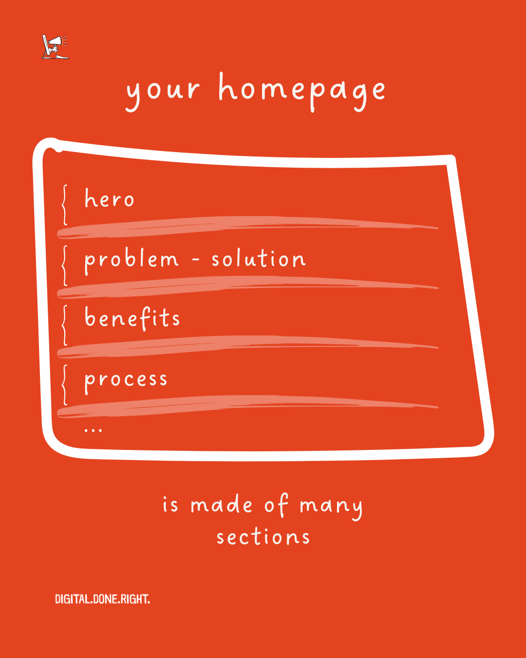
The homepage should include sections such as the hero section, social proof, problem and solution sections, benefits section, process plan section, showcasing services, social proof, overcoming objections, raising the stakes section, and a call to action.
By incorporating these elements effectively, the homepage can drive more traffic, capture visitor attention, and ultimately lead to more conversions.
👆🏻 Back to Top 👆🏻

